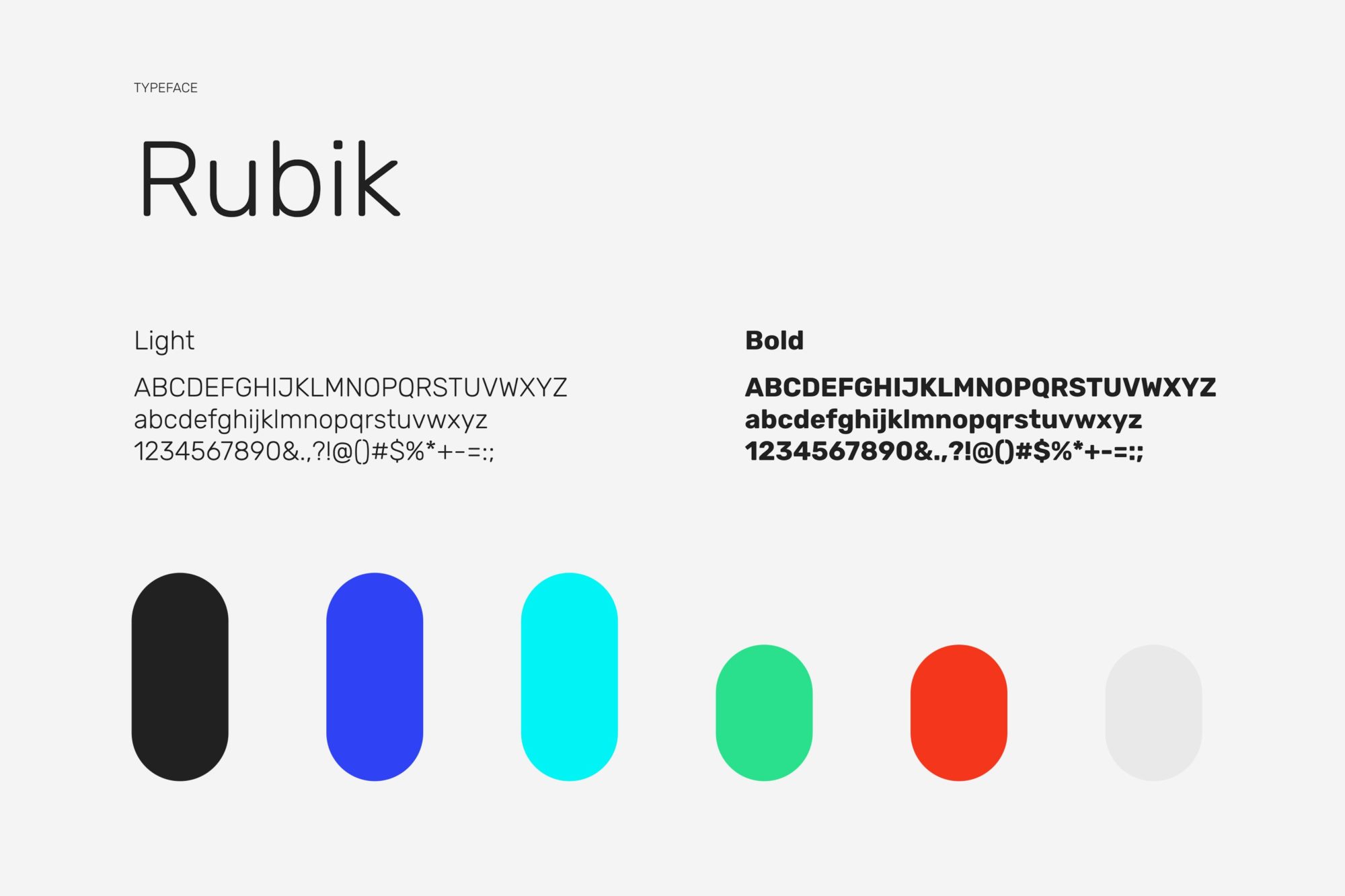
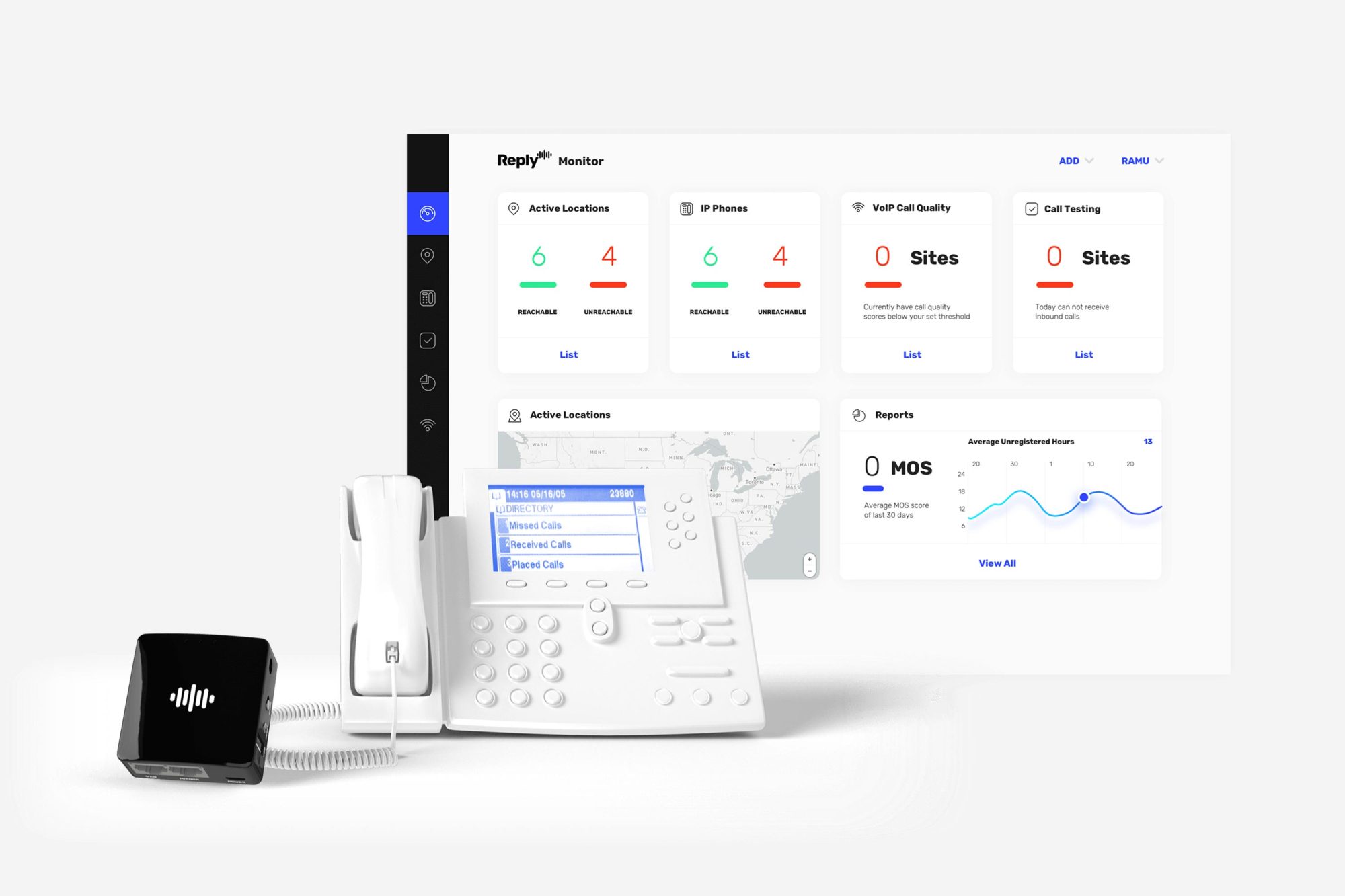
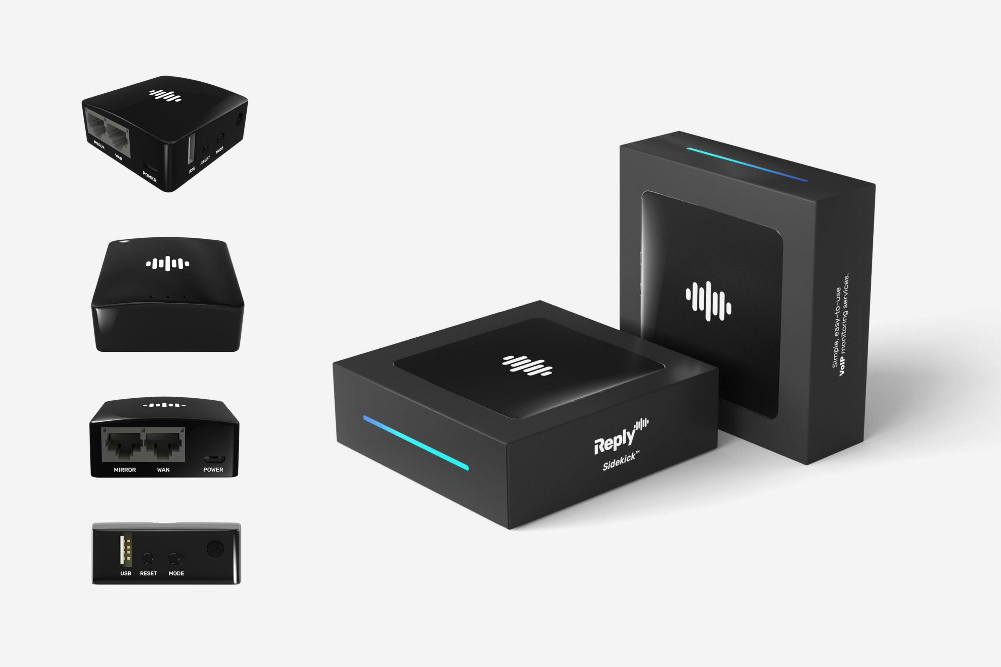
Reply approached us with a simple job, “make us look good”… and that is what we did. The Reply brand refresh covered not only the updated identity design but creating all the supporting elements for the entire product ecosystem.
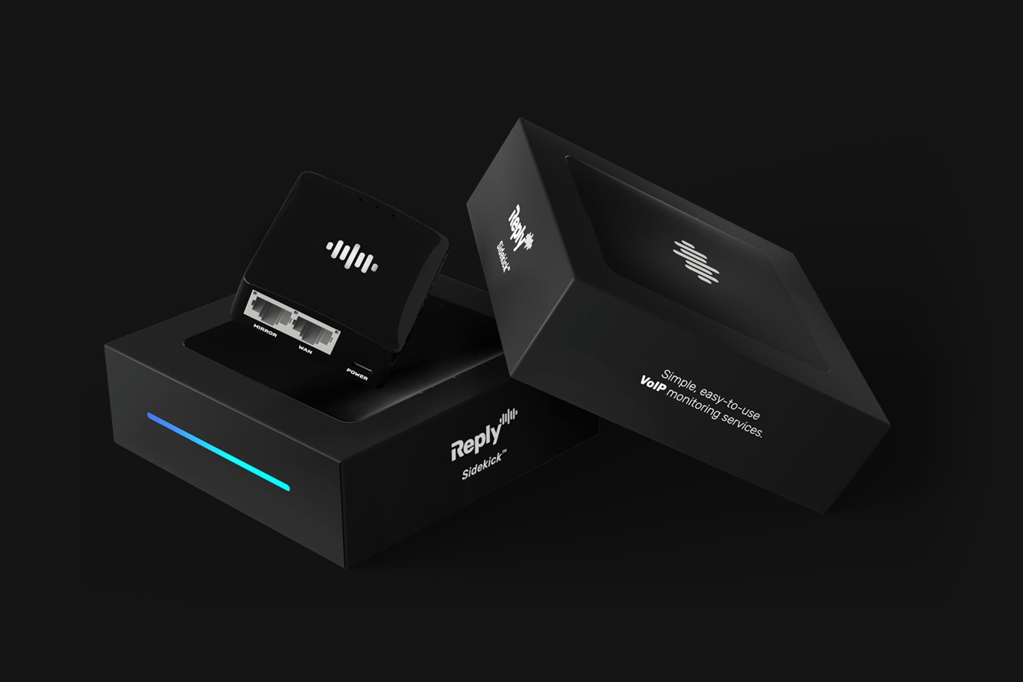
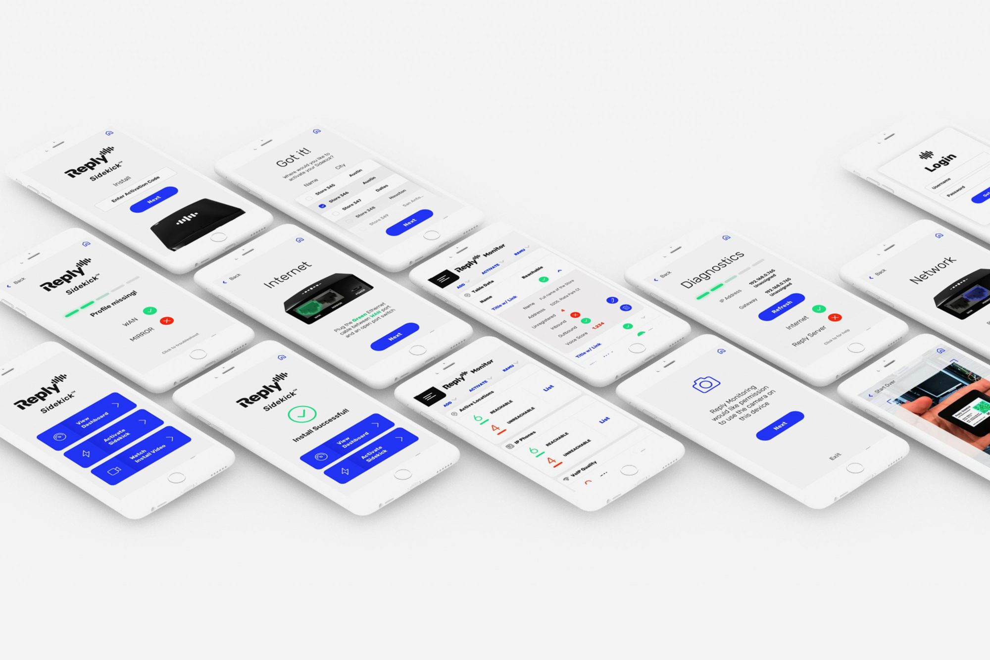
For the product we started with creating a full-scale 3D version of the hardware to replace traditional photography. After the product visual were complete we moved to the packaging, supporting app UX set up flow, as well as the cloud-based admin dashboard. To seal the deal, we created a unique landing page to inform potential customers why Reply’s VoIP box is the best in-class product on the market.


